TRADE SHOW / Nickelodeon SLIMES THE COMPETITION!
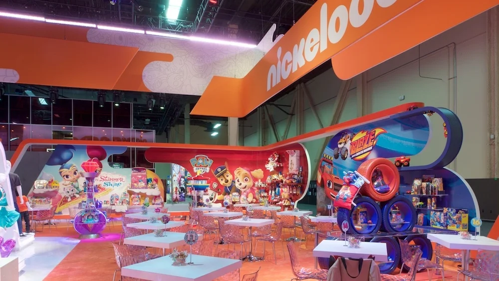
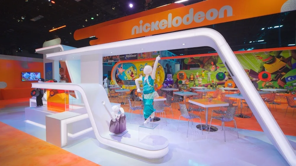
Nickelodeon has an undeniable look of youthfulness. The bright colors, the multitude of textures, and the infamous ‘slime’ are the brand identifiers. When Nickelodeon needed a space that would hold true to their recognizable appearance, but would be utilized for merchandising and meetings, Team Tangram knew exactly what to do.
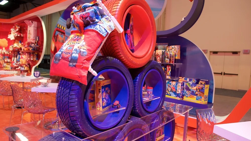
The stand was unique and noticeable in a sea of bright booths. Visitors strolled into the branded space, which was "Nick-afied" with program characters and brand patterns, by the use of motion & print graphics. Complete with custom vignettes, gallery-esc sculptures and wall art housing consumer products, along with some other fun surprises for guests to experience. There were also functional and private areas so buyers could have productive meetings with the Nickelodeon sales representatives.
The stand was smart, fun, functional, and a total triumph. By lightening the footprint on the show floor, creating intelligent branding opportunities, sharable moments, and practical work space, Tangram established a recipe for an awesome show stand! Nickelodeon was an awesome partner in the space, sharing their ideas, and listening to ours. Working as a team set the precedent for the entire show, collaboration is part of the journey!
If you found this study of interest, or would like more information, please click the "TELL ME MORE" button.


